Client: Innate Motion
Service: Strategy, Brand Identity, Design System, Website, Photography, Motion, Tone of Voice, Video
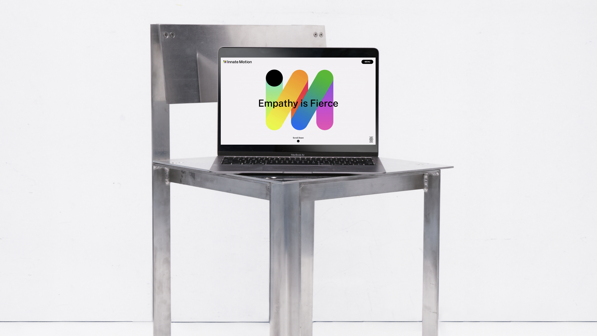
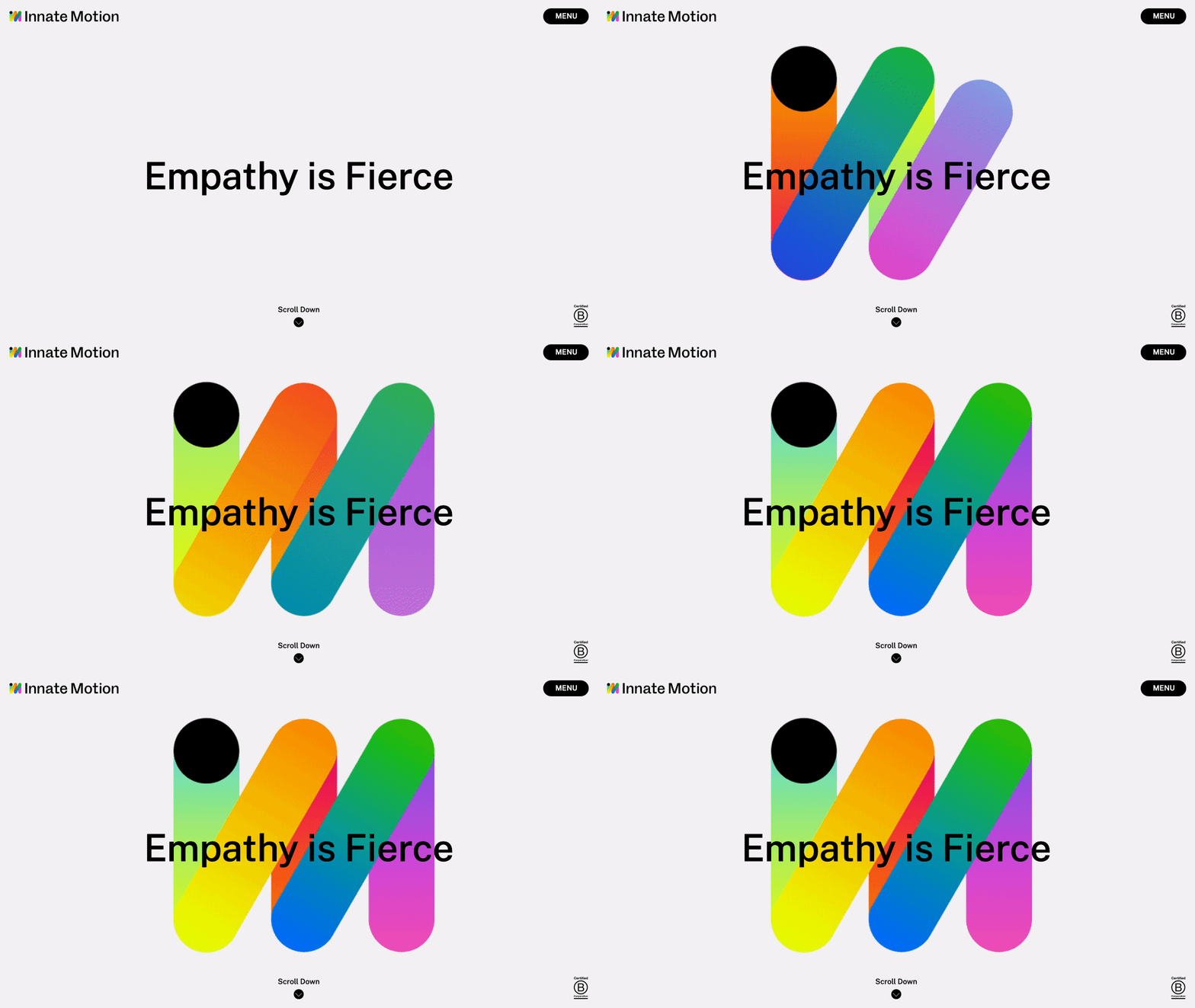

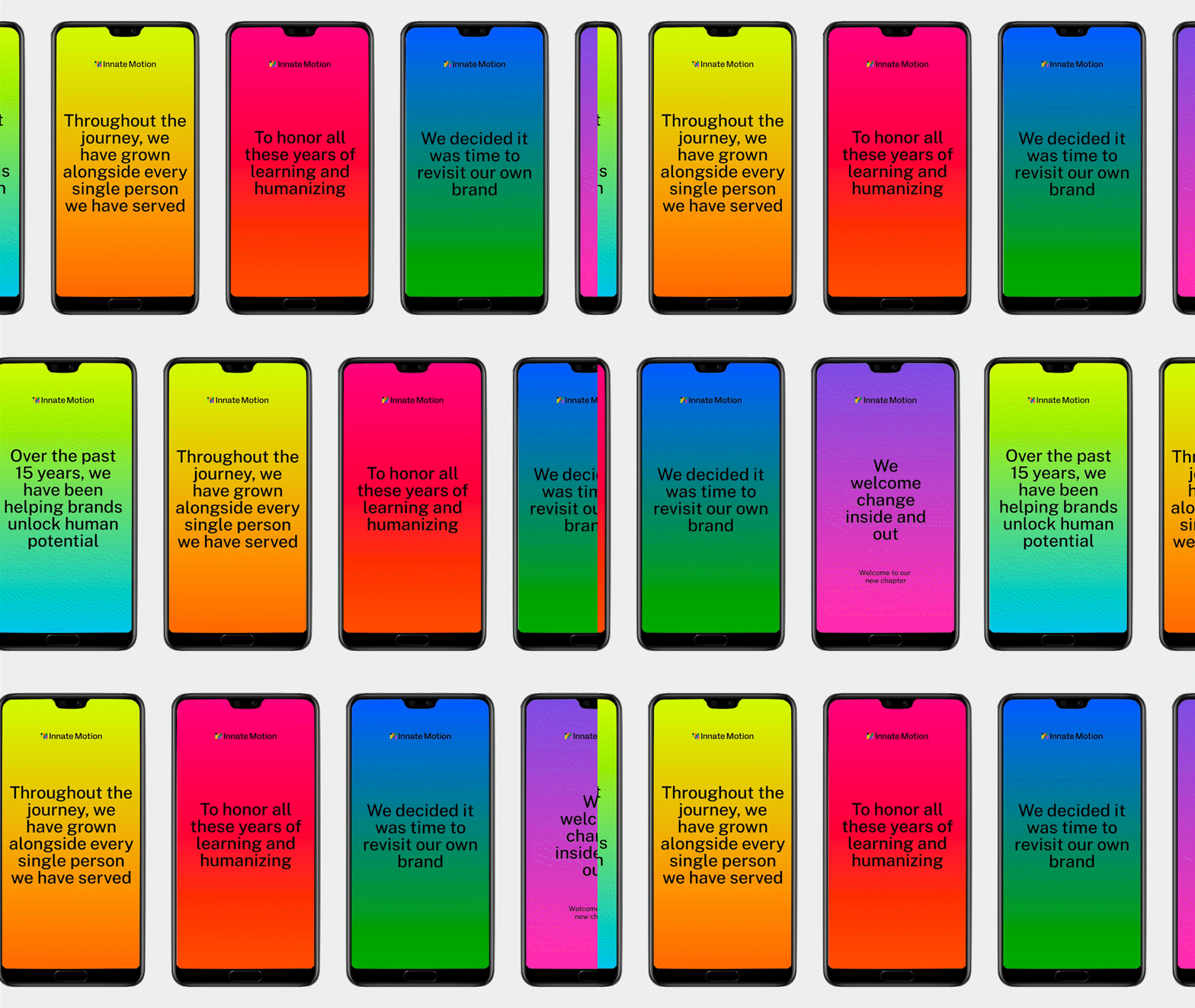

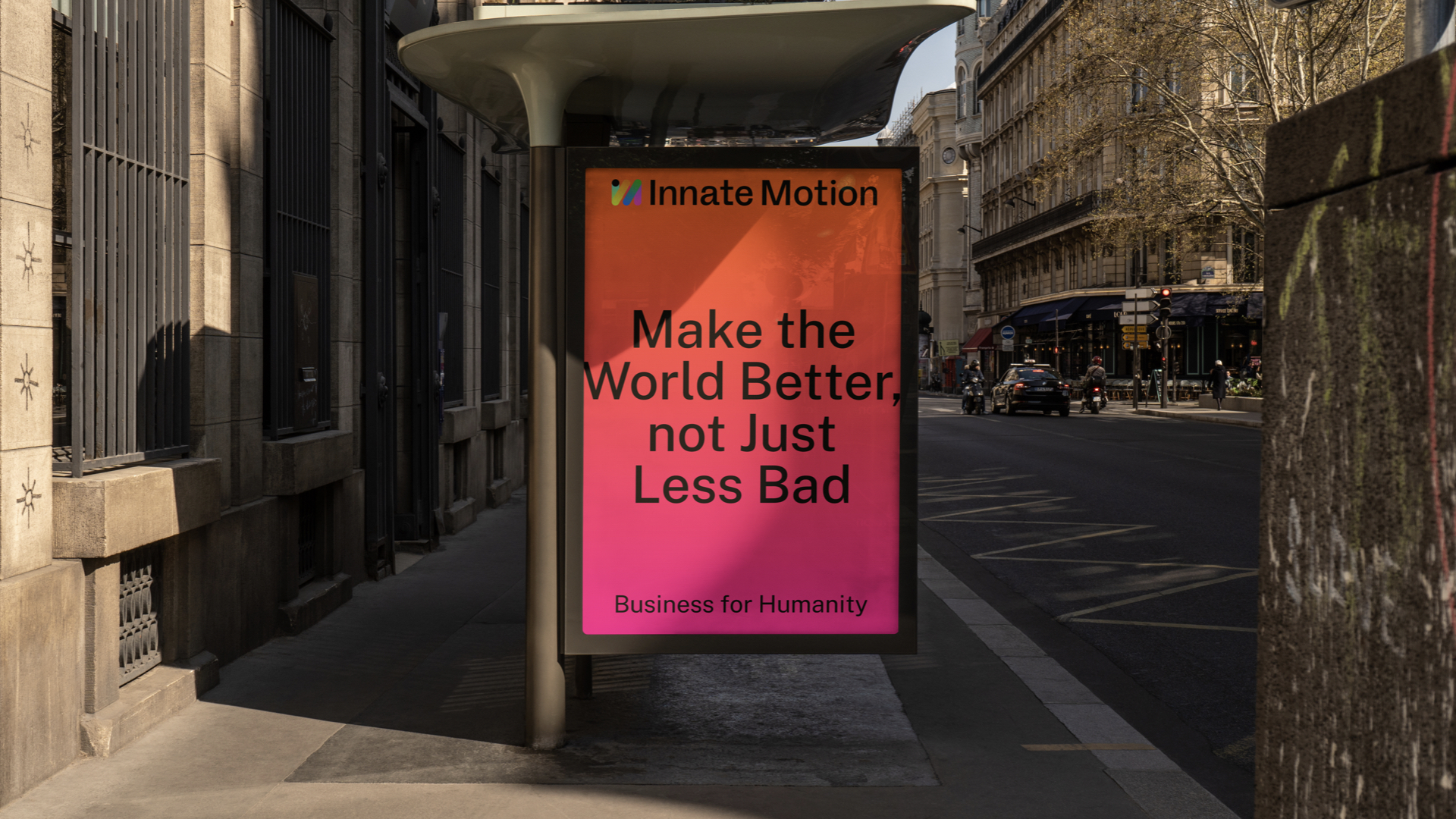
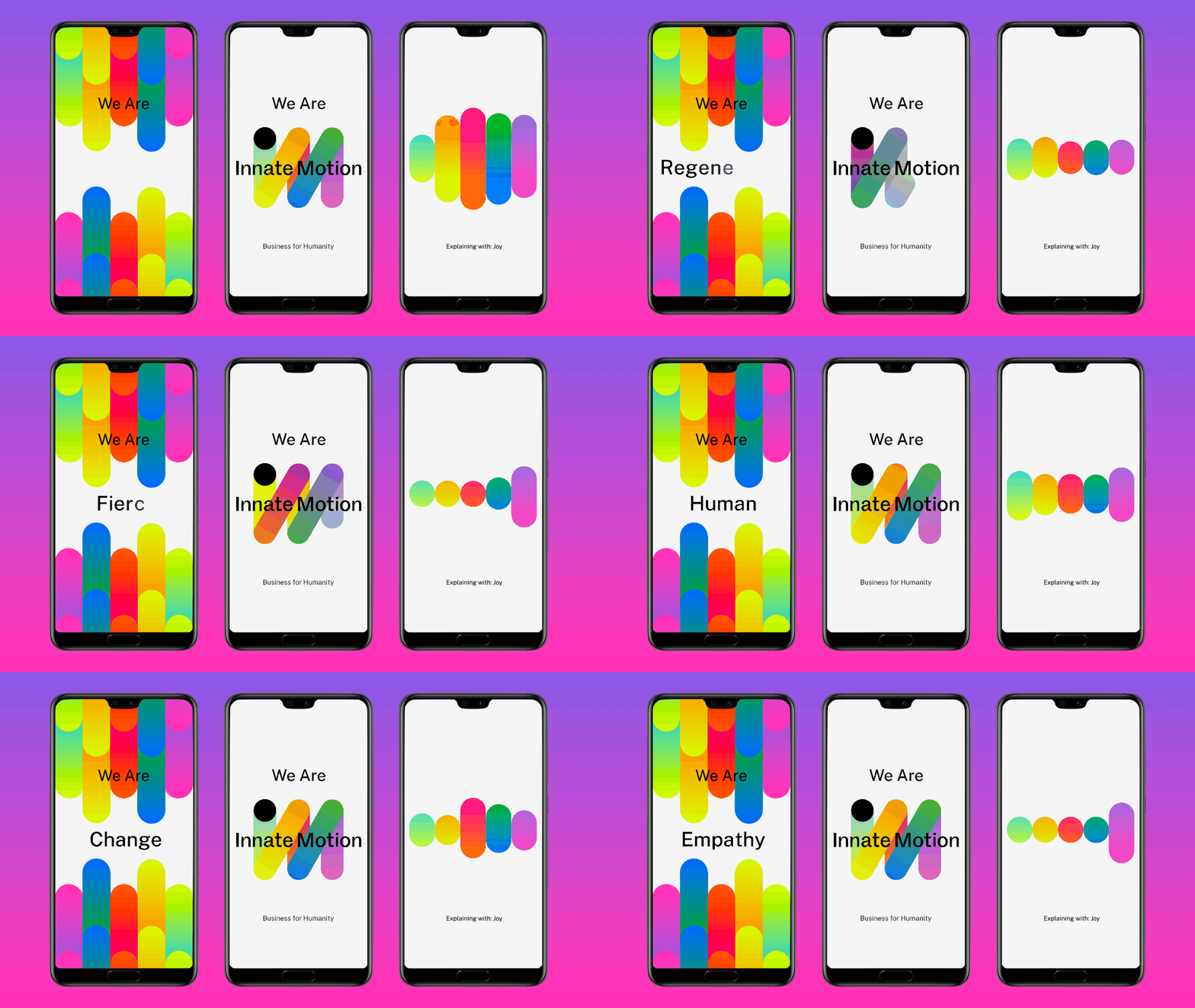
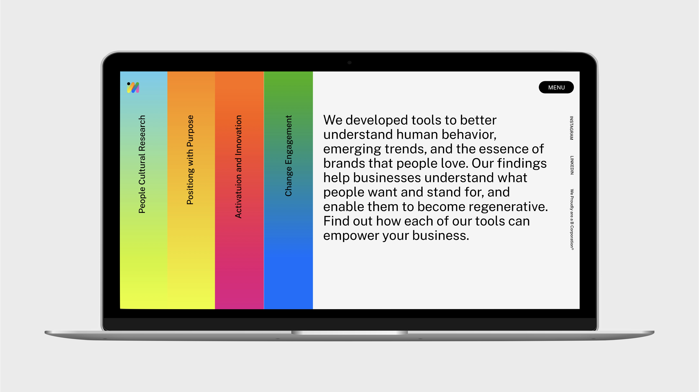
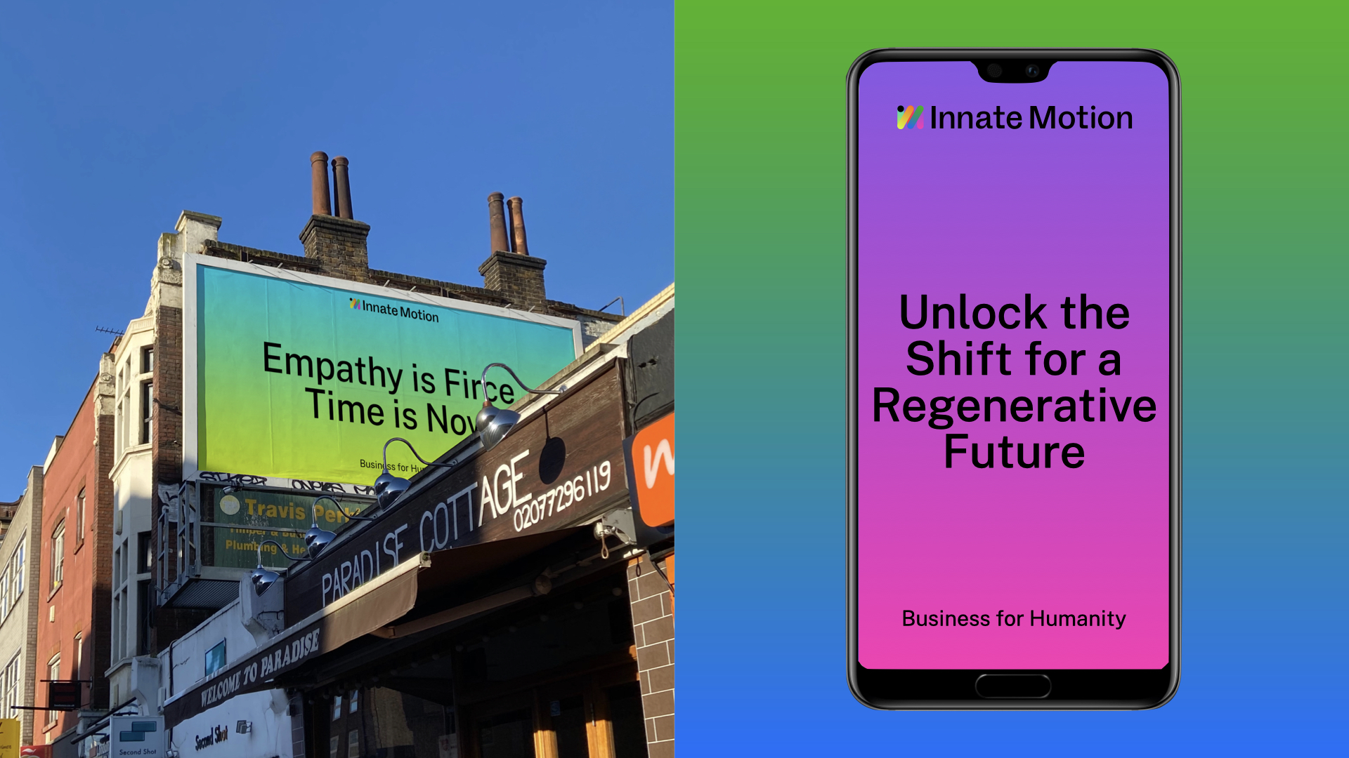
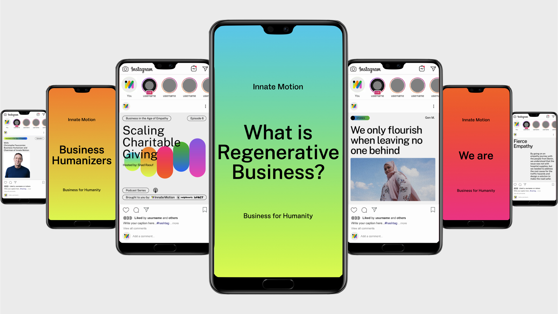

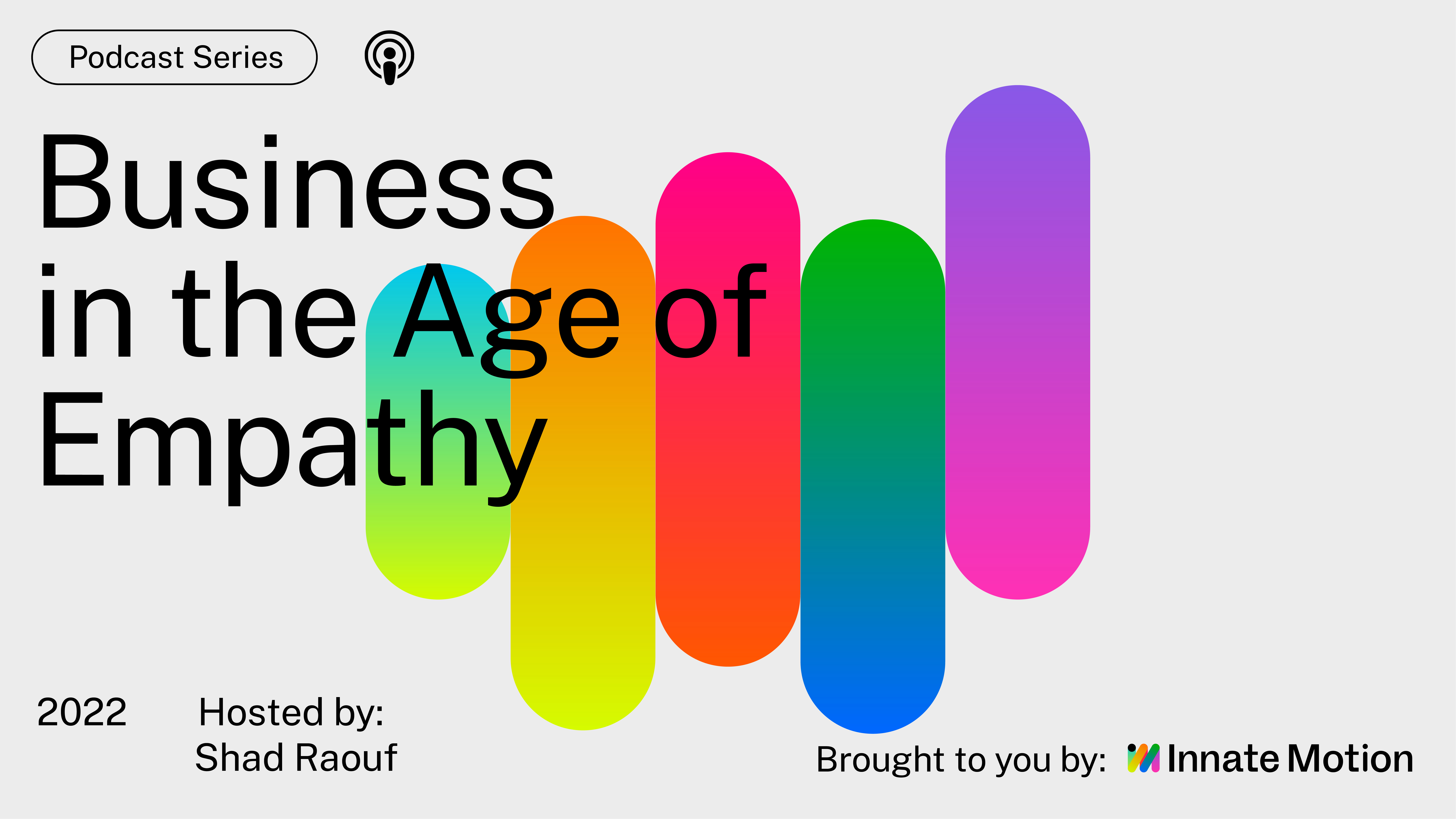
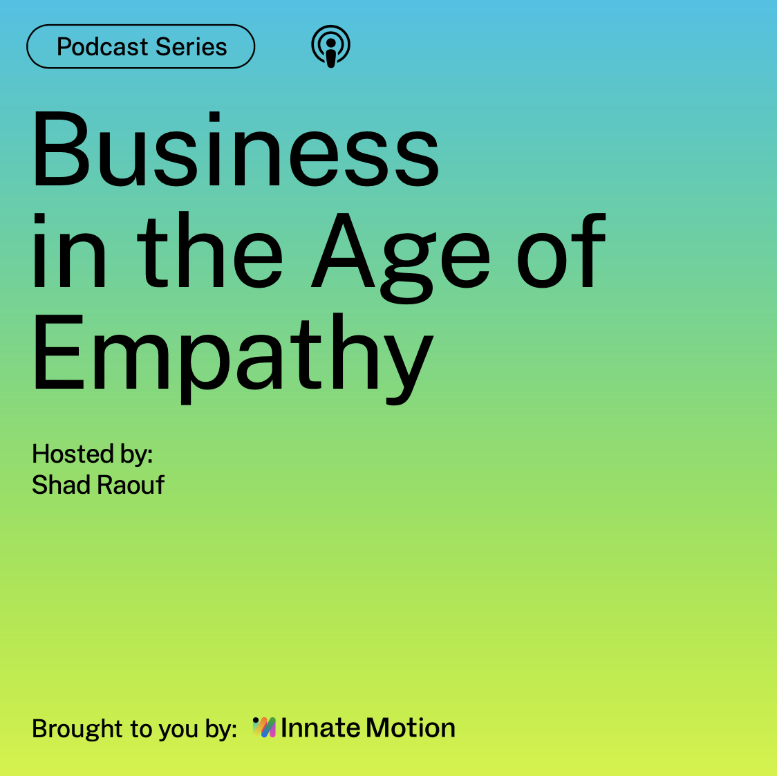

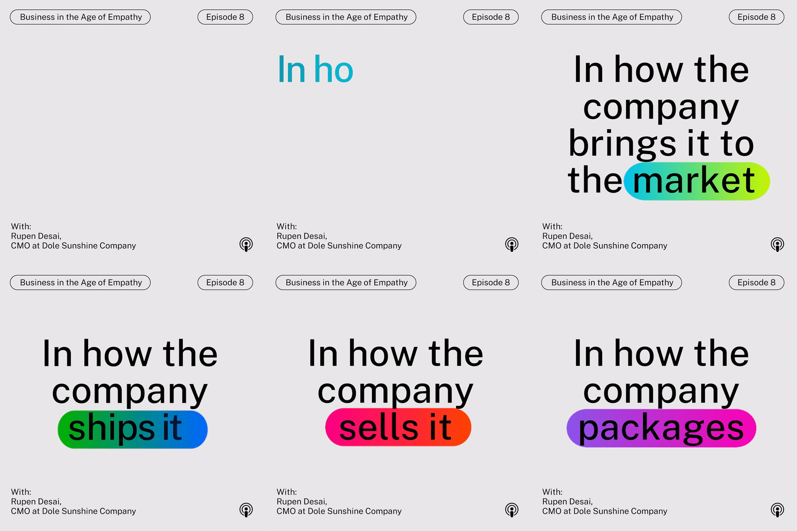

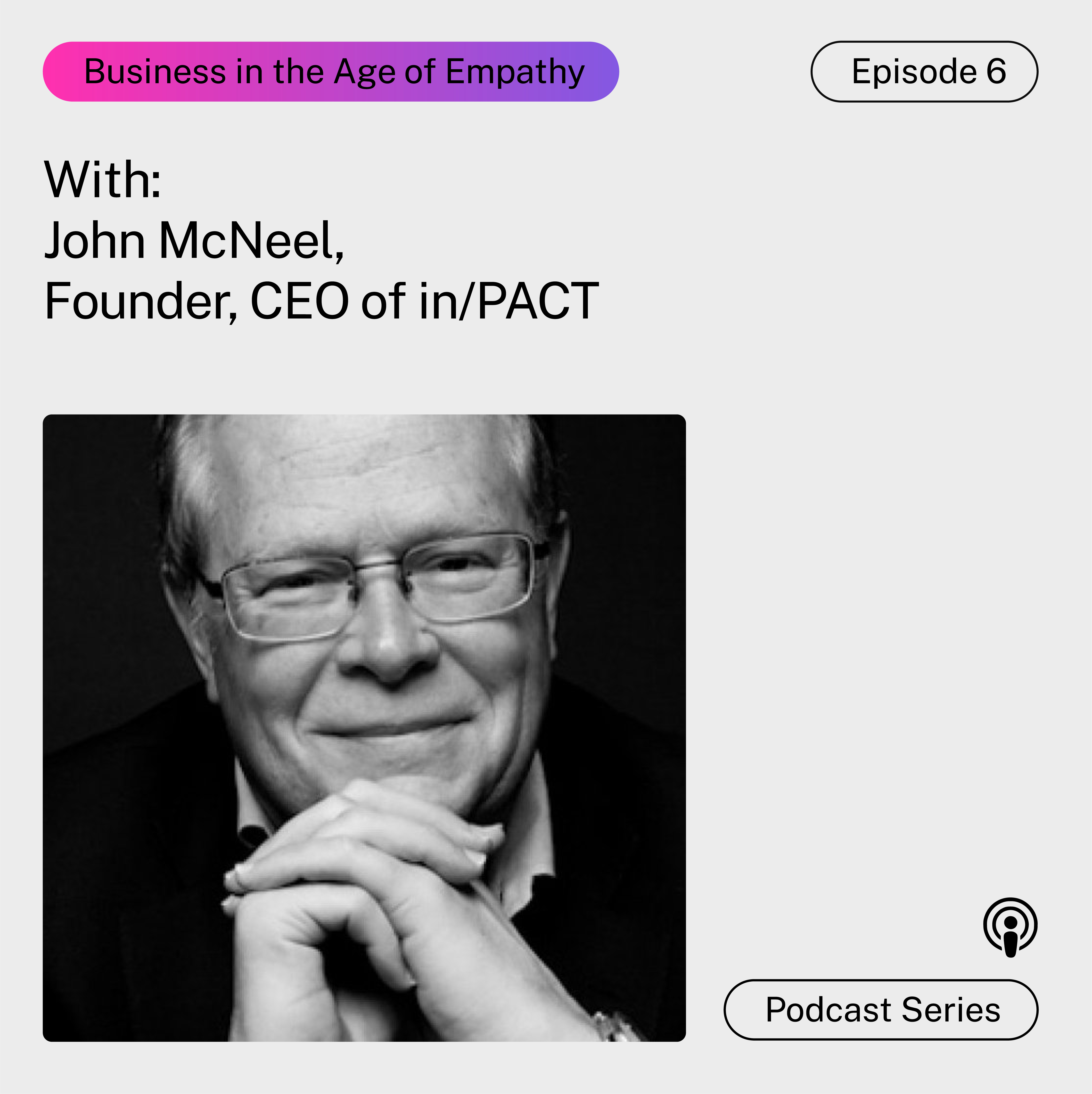
Over the past 15 years, Innate Motion, a global regenerative consultancy agency has been helping brand to unlock human potential. Throughout this journey they have grown with every company and people they served. To honor all these years of learning and humanizing, they decided it was time to revisit their brand. We worked closely with the team at Innate Motion to hone their vision, strategy, language, design, and voice. We developed a structured brand system that focuses on motion and is composed of basic visual elements and variable applications. And unfolded it into every brand expression, from digital, to video, to website. An identity that celebrates the spirit of human and empathic business.
With the concept of color in transformation, we developed an extense color palette that is bolder and more vibrant representing the energy and enthusiasm of Innate Motion’s community. Using color gradients to symbolize dialogue, diversity, multiplicity, fluid humanity, with the phrase “There is never only one absolute answer to anything” in mind, the chromatic expressions allows multiple color combinations. Each color was chosen to symbolize a shade of the human archetype, a psychology tool that is one of the foundations of the company.
The logo was built as flexible system composed of color variants. It is confident and smart and communicates inner growth, and this new moment of regeneration, empowerment and empathy. The icon translates movement, fluidity and relativity. It adds power to the brand and makes it more outspoken and bold, reduces the superficial softness naivety of the previous logo. It carries the meaning of them, and us as a collective.
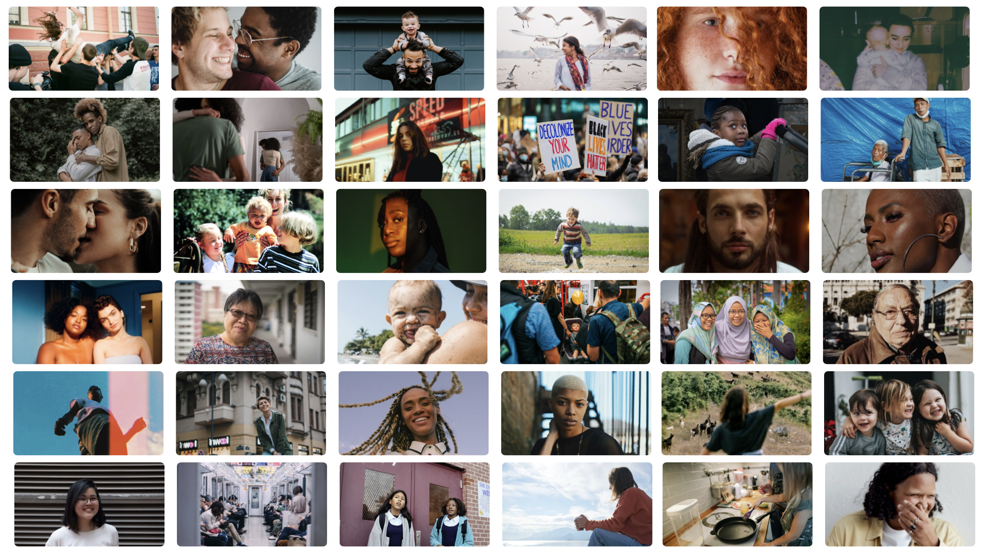
A primary Iconography pack and a secondary pack were developed focused on their archetype frameworks. Round and simple shapes that expand from the logo and connect with the brand’s concepts and ideas of human movement. The image bank was constructed with raw and powerful portraits, with grainy texture and a feeling of an instant shot, real life magic. Depictions of everyday humans in common scenes, portraying people of all ages, backgrounds and nationalities. Paired with a typeface that is simple and approachable yet reflects and encourages diversity in design directly through round edges and contrast, symbolizing humanity.